At this point I realise I need to downsize. I wont have time to do as much as I first thought but I do want my level to look finished. So my plan is to concentrate on getting the deck finished and then the finished level can be confined to just the ship.
I have also deleted my terrain as it was taking too long to build (3 hours) and slowing me down.
The photos I have of the deck are all too close to the buildings for me to get a good idea of what they look like on each side and the distance between each large asset.
I tried to use the blueprints that came in the information leaflet but they are inconsistent and show the ship before its reconstruction.
I also tried to get a google earth shot but that didn't work out
either.
I decide to take the photos and video footage I took to figure it out on paper.
Deck Assets:
I downloaded some lighting tutorials from the UDK website and deleted and rebuilt all the lighting I had set up in the ward room after learning about emissive lights, lightmass and lightmassimportancevolume bsp.
This is the deck with only a dominant directional light. As you can see the shadows are not working.
I googled the problem as much as I could but finally resorted to posting it on epicgames.com and asking for help.
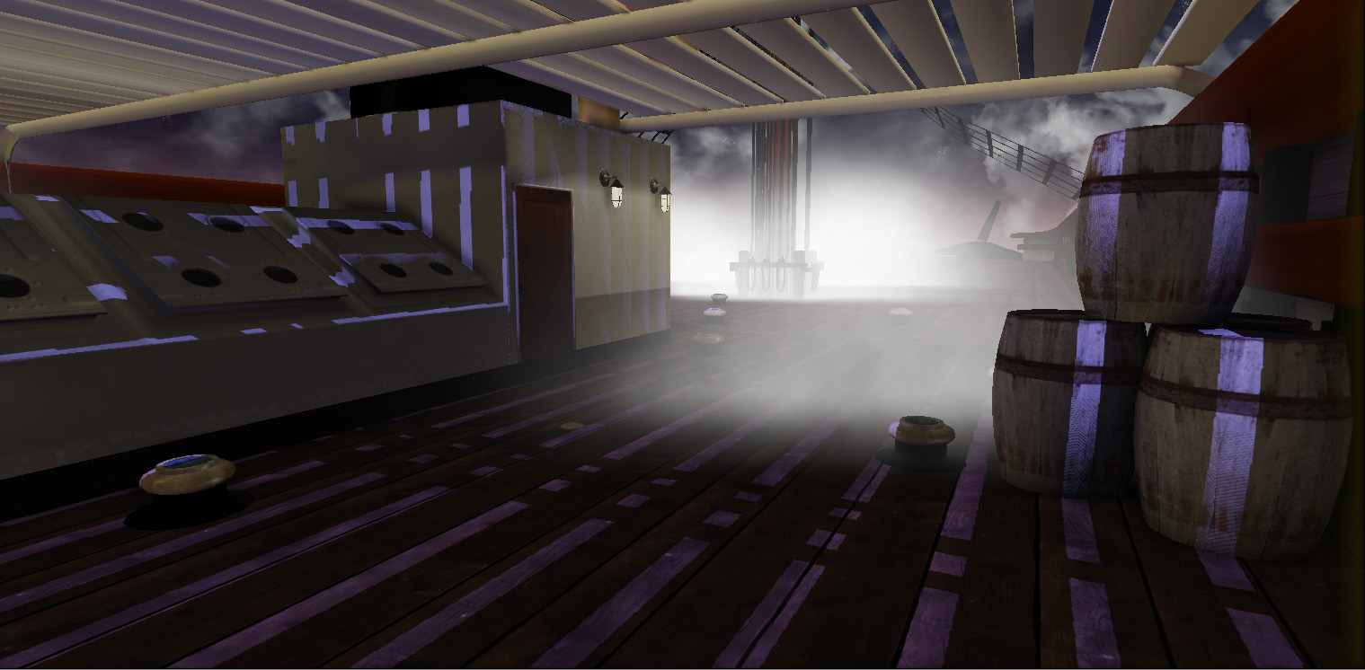
The deck seriously lacked atmosphere. I decided to change the lighting and time of day.
The main light is a shade of blue and I have chosen a subtle orange for the shadows to compliment it.
I have changed the colour of the skydome to match, and made some smoke particle effects to give a more enclosed feeling.
I think at first the smoke (being used as fog) comes of a bit strong and over the top and is constantly reminding me of resident evil, but when you actually running through the level, the fog disappears as you approach it and seems a lot more subtle and realistic.
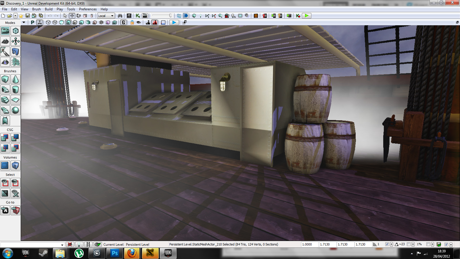
I don't know why and I don't know how, but my textures (especially tillable ones) look wrong and don't fit together.
Eager to once again take advantage of the "EpicGames" geeks, I posted another thread to try and tackle this problem.
I got some answers the next day, but didn't understand one word. Such a humbling disappointment, I have learnt so much in UDK over the past few months, but it seems I still don't speak the language. Not fluently at least.